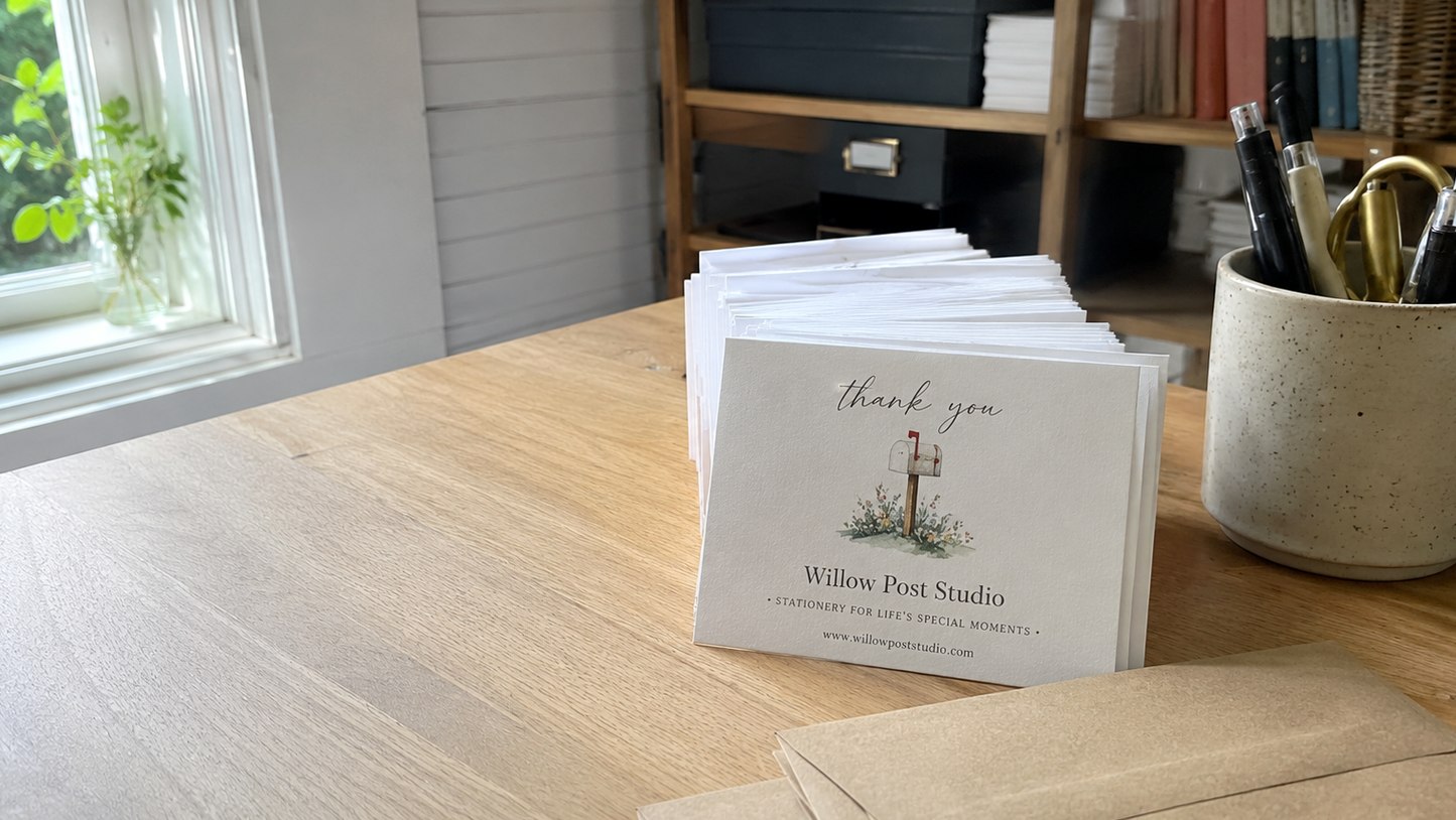
Great custom thank you cards start with simple, solid artwork: your original logo file, a short message, and a clear idea of which finish you want. Customized Thank You Cards turns those inputs into a free mockup within 24 hours, then adjusts the design for foil, letterpress, kraft or flat print so every card prints crisp and reads clearly.
- Send your original logo file, not a screenshot, for the sharpest print
- Foil and letterpress need solid shapes with no gradients or shadows
- Dark inks, white ink and foil stand out best on kraft stock
- Free mockup within 24 hours, unlimited free revisions, minimum order 12
What artwork do you need to start custom thank you cards?
To start custom thank you cards, you need three things: your logo in the best version you have, the message you want printed, and a note on the finish you are leaning toward, such as foil, letterpress, kraft or flat digital print. Customized Thank You Cards builds the first mockup from those inputs and returns it free within 24 hours, so you never need a finished print file before asking for a quote.
The quality of the logo you send matters more than anything else. A logo exported from the original design program prints with crisp edges at any size. A logo copied from a website header or a social media avatar often looks fine on screen but turns soft once it is enlarged across the front of a card.
A useful starter pack for the design team looks like this:
- Your logo, ideally the version your designer delivered, plus any one-color or reversed versions.
- Brand colors by name or by the codes in your brand guide.
- The exact wording for the front and the inside or back, including any handwritten-style signature.
- The card format you want: flat, folded, a packaging insert, or not sure yet.
- A photo or link of any card you admire, so the mockup matches your taste.
How should a logo be prepared for foil-stamped thank you cards?
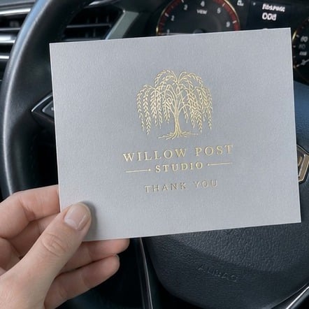
A logo for foil-stamped thank you cards should be a solid, single-color shape with no gradients, drop shadows or photographic texture. Foil is applied with a heated die, so every part of the artwork either gets foil or does not. Soft fades, glows and very thin hairlines do not translate, and the design team will simplify them in the mockup if they appear in your file.
Think of each foil color as its own layer. A gold logo with a black message is two separate pieces of artwork: the foil layer and the ink layer. Keeping those layers clearly separated in your file, or simply telling the team which elements should shine, saves a round of revisions.
Small type is the other watch-out. Delicate serif lettering and fine script can fill in when foil is pressed into paper. If your brand uses a thin script for a tagline, ask to see that line in foil on the mockup, and consider keeping the script in ink while the logo carries the foil. The foil-stamped thank you cards page shows how the finish reads on different stocks.
How is letterpress artwork different from flat print artwork?
Letterpress thank you cards are printed from a plate that presses ink into thick, soft paper, so the artwork has to be built from solid shapes and lines, one plate per ink color. Flat digital print can reproduce almost anything, including photos and gradients, because the ink sits on the surface instead of being pressed into it.
That difference changes how you prepare a design. For letterpress, limit the palette, avoid large solid floods of ink, and give fine lines enough weight to print cleanly. Large solid areas can look mottled on cotton stock, which some brands love as character and others read as uneven. For flat print, the main concern is that colors and photos are high enough resolution to stay sharp.
| Finish | Artwork that works best | Artwork to avoid |
|---|---|---|
| Flat print | Full color, photos, gradients, patterns | Low-resolution logos pulled from the web |
| Foil stamping | Solid logos, bold type, simple icons | Gradients, shadows, hairline strokes |
| Letterpress | Line art, type, one or two ink colors | Photos, large solid floods, tiny text |
| Kraft stock | Dark inks, white ink, bold marks | Pale pastels that fade into the brown fiber |
See the letterpress thank you cards page for more on plate-printed work.
Which colors print well on kraft thank you cards?
Dark, saturated colors print best on kraft thank you cards. Black, deep navy, forest green and rich burgundy hold their contrast against brown kraft fiber, while light pastels and soft grays tend to sink into the paper and look muddy. White ink and foil are the usual answers when a brand needs a light color to stand out on kraft.
Kraft is uncoated and naturally toned, so every ink color shifts slightly warmer than it looks on a white screen. Your mockup will show the design on a kraft background, but treat that preview as a guide rather than a perfect color match. If one specific brand color must be exact, mention it when you request the quote so the team can recommend the closest printable option.
Kraft also changes how you plan layout. Bold logos and simple messages read better than busy designs, because the fiber texture adds visual noise of its own. Brands that ship in kraft mailers often pick kraft thank you cards so the insert matches the box.
What should you check on a thank you card mockup before approving?
Before approving a thank you card mockup, read every word aloud, confirm the format and finish, and check that nothing important sits too close to the trimmed edge. The mockup is the last point where changes are free and easy. Customized Thank You Cards offers unlimited free revisions, and you pay nothing until you approve the design.
- Spelling and names. Read the message, signature and any web address letter by letter. Typos in a sign-off are the most common reprint reason.
- Front and back. On folded cards, confirm what prints on the front, the inside and the back.
- Safe area. Text and logos should sit comfortably inside the card, not touching the edge where trimming happens.
- Finish callouts. Confirm which elements are foil, which are ink, and which are blind or uncolored.
- Stock and format. Match the paper, size and envelope choice to what you discussed.
- Quantity. Confirm the count, remembering the minimum order is 12.
Ask a second person to proof as well. Fresh eyes catch the errors that the person who wrote the message reads past.
What are the most common artwork mistakes on custom thank you cards?
The most common artwork mistakes on custom thank you cards are blurry logos, text placed too close to the edge, color expectations set by a bright phone screen, and too many elements crowded onto a small card. Each one is easy to catch on the mockup and expensive to discover after printing.
- Screenshot logos. A logo grabbed from a website or email signature is usually too small to print cleanly. Send the original file whenever you can.
- Edge crowding. Designs that run text right to the border risk being nicked during trimming.
- Screen color. Phones and monitors glow; paper reflects. Expect printed colors to look a little deeper and calmer.
- Overloaded fronts. A logo, tagline, social handles, website and a discount code compete for attention. Pick one job for the front and move the rest to the back.
- Thin script in foil. Fine strokes can fill in. Ask to see the script at real size on the mockup.
For packaging insert cards, a short message with one clear next step usually outperforms a card trying to say everything.
Can each thank you card in one order carry different artwork?
Thank you cards in a single order usually share one design, but a team can often plan small variations, such as different signatures or messages for separate departments, as long as each version is set up clearly. Tell the design team about variations at the start so the mockup shows every version side by side.
The cleanest way to handle variations is a simple list: version name, the line that changes, and how many of each. Keep the logo, finish and layout identical across versions so only the changing line needs to be checked. That approach suits real estate teams with several agents, wedding couples sending notes from both families, or a small business that wants one card for customers and another for wholesale partners.
If you need fully different fronts, such as a holiday design and an everyday design, treat them as separate designs and confirm the quantity for each on the quote. Browse flat thank you cards and folded thank you cards to decide which format gives each version the room it needs.
How long does artwork review take before printing?
Artwork review for custom thank you cards starts with a free mockup within 24 hours of your request, then moves as fast as you can reply with changes. Once you approve the design, standard production is about 2 weeks, with faster turnaround available through express shipping.
The biggest delay is rarely the printer. It is waiting on a better logo file, a final message wording, or sign-off from a partner or manager. Gathering those before you request a quote keeps the whole schedule short. If a wedding date, store opening or product launch is fixed, mention it up front so the team can plan the revision rounds around it.
Ready to start? Send your logo and message through the custom quote form, or read how it works to see each step from mockup to delivery.
Frequently asked questions
Do I need a professional designer to order custom thank you cards?
No designer is required to order custom thank you cards. Customized Thank You Cards creates the layout for you from your logo, message and finish preference, then sends a free mockup within 24 hours. You can request unlimited free revisions until the card looks right, and you pay nothing until you approve the final design.
Can thank you cards be designed from a hand-drawn sketch?
Thank you cards can start from a hand-drawn sketch, a napkin doodle or a photo of a card you like. The design team uses the sketch as direction and rebuilds it as clean artwork suited to print, foil or letterpress. A clear photo taken in good light helps the mockup capture the shapes and spacing you intended.
How many foil colors can one thank you card use?
Foil-stamped thank you cards most often use one foil color, because each extra foil needs its own die and its own pass through the press. Gold, silver, rose gold and copper are popular single choices. If your design calls for more than one foil, describe it on the quote request and Customized Thank You Cards will advise what works.
Will my brand colors match exactly on printed thank you cards?
Printed thank you cards come very close to brand colors, but paper stock, coating and lighting all shift how a color reads. Coated white stock shows colors most faithfully, while kraft and cotton warm them slightly. Share your brand color codes with the quote request so the team can choose the closest printable match for your chosen stock.
Can thank you cards include a QR code?
Thank you cards can include a QR code linking to a review page, a reorder page or a discount offer. Keep the code on a light, plain background with clear space around it, and avoid placing it across a fold. Scan the code on the mockup with your own phone before approving, so you know it opens the right page.
Should the back of a thank you card be printed or left blank?
The back of a thank you card works well for a website, social handle or short care note, especially on packaging inserts. Leaving it blank keeps a premium, minimal feel and gives space for a handwritten line. Customized Thank You Cards can show both options on the mockup so you can compare them before deciding.
Can a signature be printed on custom thank you cards?
Custom thank you cards can carry a printed signature scanned from your own handwriting. Sign in dark ink on plain white paper, photograph or scan it in good light, and send the image with your quote request. The design team cleans up the background so the signature prints crisply, whether in ink or in foil.
What makes a thank you card design look premium?
A premium thank you card design usually relies on restraint: generous white space, one strong logo, a short message and a single tactile finish such as foil or letterpress. Heavier paper and a matching envelope add to the feel. Crowded layouts with many fonts and colors tend to look promotional rather than personal and gracious.
Can thank you cards be reordered with small artwork changes?
Thank you cards are easy to reorder with small changes, such as a new address, an updated tagline or a seasonal message. Customized Thank You Cards keeps your approved design as the starting point, sends a fresh mockup showing the edits, and you approve it before anything prints. The minimum order of 12 applies to each reorder.
How much text fits comfortably on a thank you card?
Thank you cards read best with one or two short sentences on the front or inside, plus a sign-off. Small cards and packaging inserts leave less room, so long paragraphs force smaller type that is harder to read and harder to print in foil or letterpress. Write the message first, then trim until every word earns its place.
Can I approve thank you card artwork for a team without meeting in person?
Thank you card approvals happen entirely online, so a team can review the same mockup from different offices. Forward the mockup link or file to each decision maker, collect their notes in one reply, and send combined changes to Customized Thank You Cards. Gathering feedback in one message keeps revision rounds quick and avoids conflicting edits.
Is a matching envelope design included with thank you cards?
Thank you cards can be paired with envelopes, and many buyers add a return address or small logo on the envelope flap to match. Mention envelope printing on your quote request so the mockup shows the card and envelope together. Plain envelopes in coordinating colors are a simple alternative that still looks finished and polished.
Get a free mockup for your thank you cards
Send your logo or idea and the quantity you have in mind. Customized Thank You Cards returns a free mockup within 24 hours, you approve the design before anything is produced, and standard turnaround is about two weeks with faster options available. Get a custom quote.